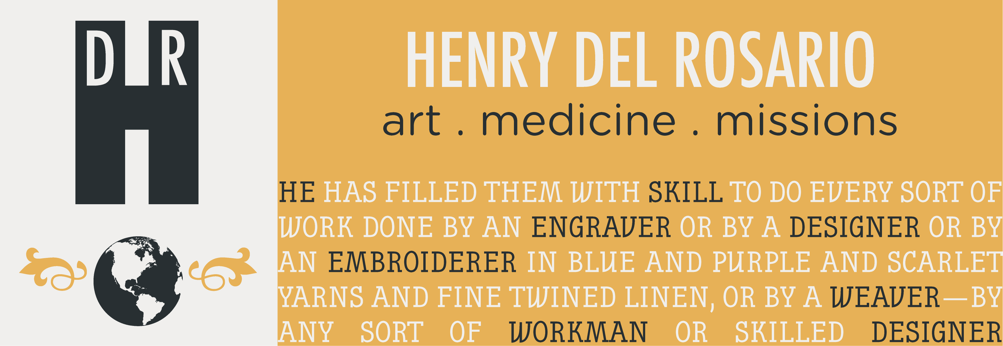
Combining Typefaces

Combining more than two typefaces gives me headaches because I have no systematic method to find out what works and what doesn’t! I recently read a post by H&FJ on typography.com about combining typefaces and they offered a guide to help people like me!
They spoke of 4 techniques when creating a combination typeface palette:
- Wit – mix typefaces with complementary moods
- Energy – mix typefaces from the same historical period
- Poise – mix typefaces of similar line quality but different textures
- Dignity – mix typefaces with similar proportions but different roles
In my example above, I used a “witty” palette by combining 3 typefaces corresponding to a complementary mood:
- Futura =industrial
- Gotham rounded = pulpy
- Nautik = natty
The combination of these different moods makes for a very complex landscape that I’d never think of creating on my own! Looking at it at as a whole, I see that it looks smart but playful, purposeful but with flair, straightforward but not without one or two fun detours. Try it!
Exodus 35: 35
He has filled them with skill to do every sort of work done by an engraver or by a designer or by an embroiderer in blue and purple and scarlet yarns and fine twined linen, or by a weaver—by any sort of workman or skilled designer.
Leave a Reply